
Petit Poutinerie
BRAND IDENTITY, ART DIRECTION, LAYOUTA long standing institution in the Rochester culinary scene, you could often find the ladies of Petit Poutine parked outside of bars and nightlife playfully roasting customers waiting for fries and gravy. That was my first interaction with them. And it felt kind of outlaw-ish, as they were existing in this legal gray-area for food trucks at the time (2011). Fast forward 11 years: they were finally ready for a brick and mortar and wanted a rebrand to reflect this glow up.
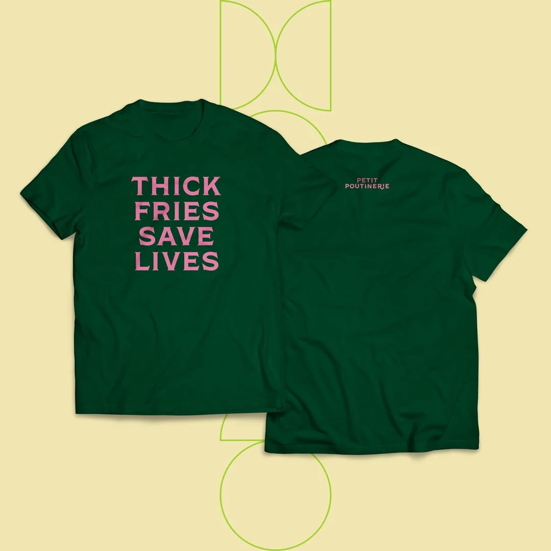
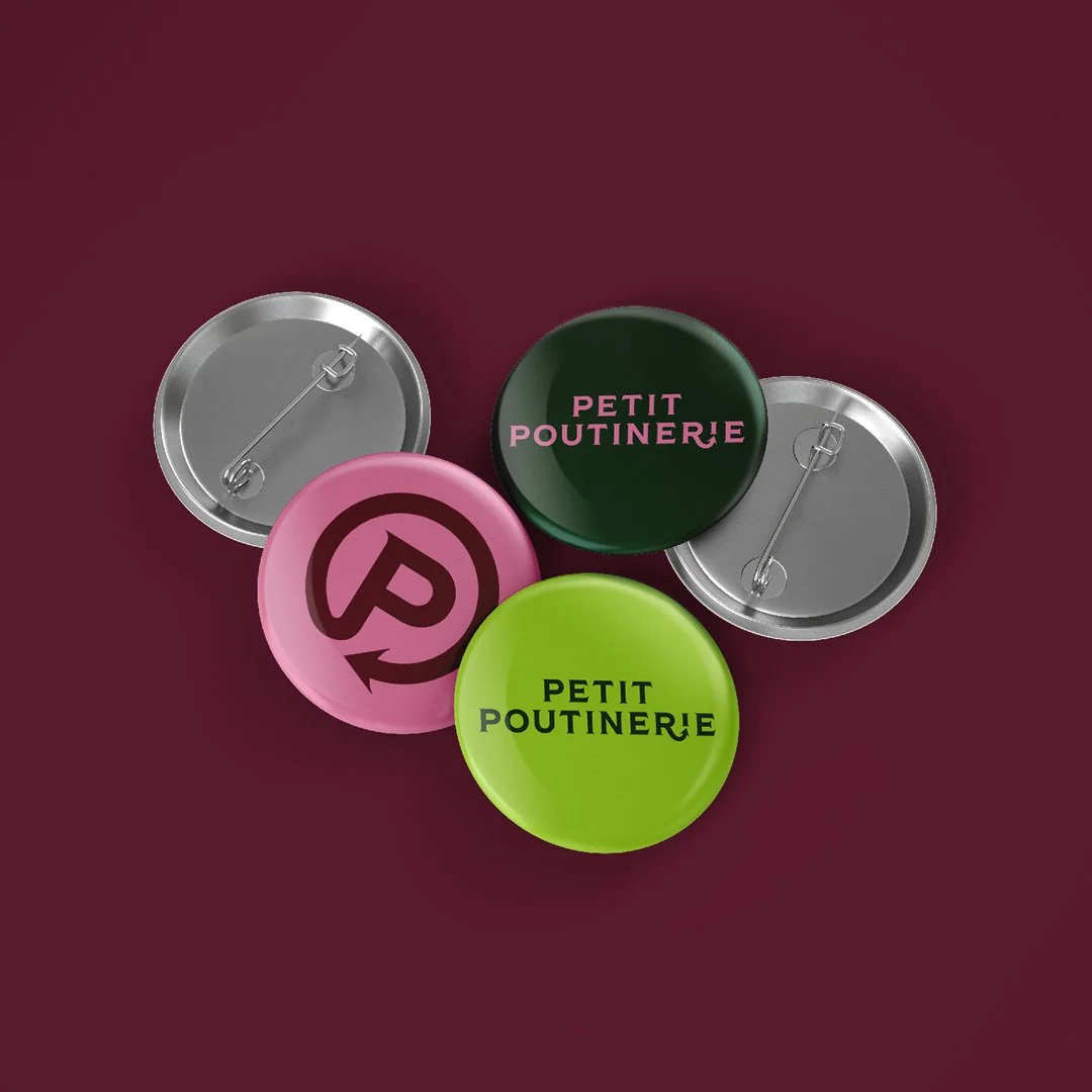
After careful consideration, we decided on a slight name change—from Petit Poutine to Petit Poutinerie & The Poutine Truck. With this name change, we also wanted to re-introduce the playful mischief from the early years of the brand. We landed on a super clean, elegant approach that heavily features the sharp edges of Shackleton Bold, paired with a kiss of mischief with the devil’s tail. Inviting the audience to give into their desires and indulge with them, but don’t actually get too close.


PHOTOS: MATT WITTMEYER